How your user onboarding can make a great first impression
Main illustration: Lucy Reynolds
As the saying goes, “You never get a second chance to make a good first impression.” So the obligation to make first impressions positive and memorable is immense.
This is especially true for onboarding. Great onboarding is multifaceted. Like the early stages of a burgeoning relationship, multiple steps shape the outcome and determine whether the relationship between you and the user will be a wild success, an unremarkable encounter or a dismal failure.
The goal of onboarding isn’t to show new users where features are. Instead, it’s to guide users towards their “aha” moment, the moment of delight where the value of your product becomes immediately clear.
As my colleague Ruairí Galavan explains in his C.A.R.E framework, three core components make up successful onboarding:
- UI design patterns
- Contextual educational content
- Contextual communication
It is vital to consider how these components interact throughout the customer lifecycle and in different channels, but they should also come together in that very first impression, the moment of first use.
A positive first impression that shows the true value of your product sets the tone for a fruitful, long-lasting relationship with your user.
Get to know your customers’ needs
To build that lasting first impression, first understand the actions your users should take and how to motivate them. Answer these questions:
- What do you need to know about your users to provide them with a great experience?
- What do users need to do to get value from your app?
- What are the costs and benefits of adding friction to your onboarding?
- How will you motivate users to complete onboarding?
- At what point in your users’ lifecycle does onboarding need to be completed?
- What actions must your users take regularly to drive growth and revenue?
Answering these questions takes time and experimentation, but it pays to consider the answers as you craft the very first encounter users will have with your product. Those first impressions will define so much of the relationship to come, so do everything you can to make it the start of something beautiful.
Useful UI design patterns
Once you’ve determined what your first use experience needs to achieve, it’s time to consider the UI design patterns you can use to create that experience.
“The first time someone uses your product, they’re likely a little disoriented”
Put yourself in the shoes of a potential customer. The first time someone uses your product, they’re likely a little disoriented as they attempt to familiarize themselves with the new environment – your app’s UI. They’ll be searching for cues to find their way.
UI design patterns like empty states and inline hints and tips can help make the unfamiliar feel familiar and get the user to see value, fast. Let’s run through the most useful patterns.
Welcome message
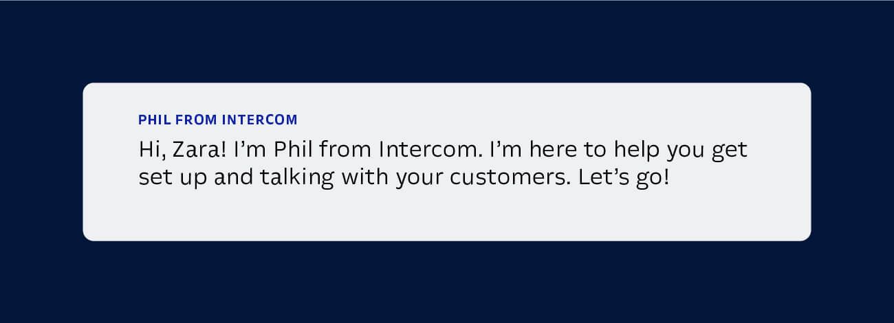
They might seem incredibly simple but a considered welcome message can make or break your tour. This is your first opportunity to greet your new user, so it’s important to be warm and approachable and give them a reason to engage.
Modal
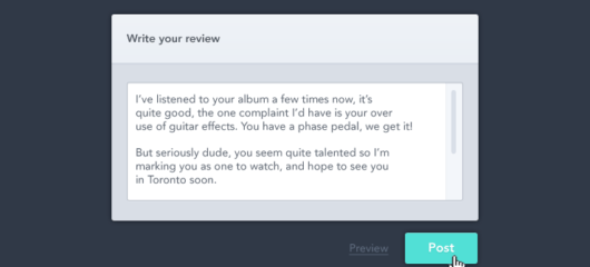
A large window that takes priority on your screen, most often dimming the background, the modal is an effective design pattern for focusing the user’s attention. But it may come across as noisy if not used well. You’ll often see a modal when you sign up for a product and are asked for your email address.
Modal windows work well with contextual educational content like videos or GIFs. However, if you’re referencing a specific element within your app, the focus should be on that element, not on the modal.
Empty state
Empty states are how your app or product looks on first use before it’s filled with user content. An empty product or app can appear like a blank page to a novice writer – it can feel overwhelming. Not only are users trying to get oriented with this new space, they’re excited to jump in and get started, but they need guidance and reassurance on how to proceed. However, a well-designed “empty state” design pattern can offer reassurance by providing context and setting expectations, guiding the user to fill in content and take important steps.
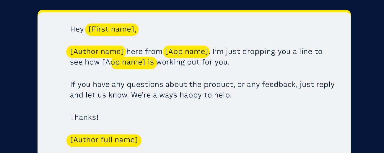
Rather than leaving an intimidating void, an empty state design ideally prompts the user to begin filling in the content. Or it can include sample content to illustrate the app’s value and help the user feel more confident about taking the next step. With Intercom, the first time users sign in, they’re presented with sample messages they can edit and send.
Inline hints and tips
Inline hints and tips are subtle and look as though they fit in with the rest of the content on the page. Their subtlety is what sets them apart from the other UI design pattern. As a result, they should be used to enhance a user’s success in your product, for instance by providing additional information about a complex feature or best practice tip.
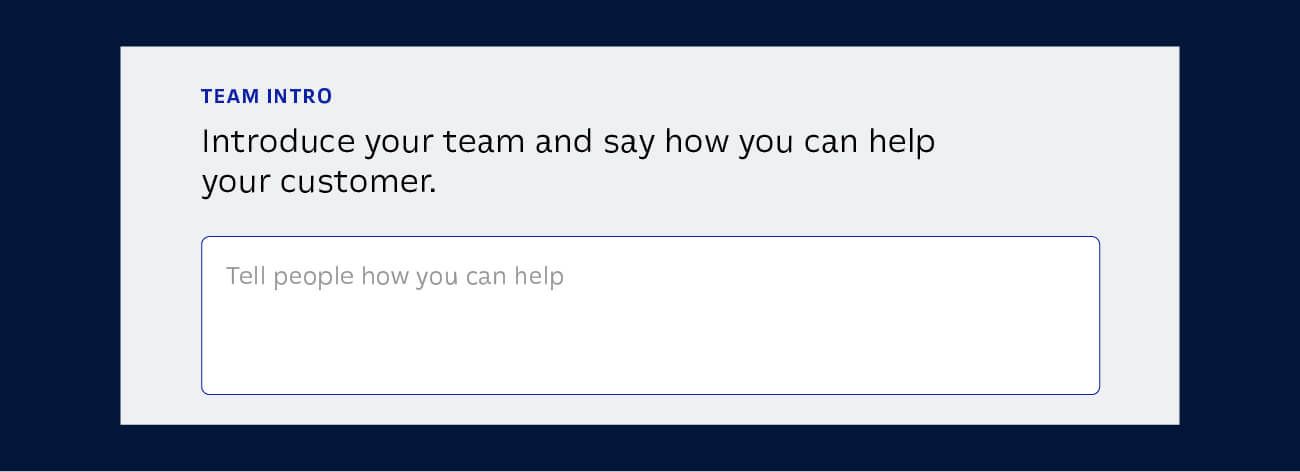
To pick the best UI pattern for your message, consider a content hierarchy. Is this a “need to know” or a “nice to know” tip?
Tooltips
Traditional tooltips are text labels that appear when a user hovers over a field, link or UI element, and disappear when a user moves their pointer away.
“Avoid the temptation of relying on tooltips as a substitute for well-designed interface elements”
They’re always available for users to access, so can be considered as an occasionally visible layer of the UI and not just as an onboarding tool for first-use experience. Tooltips can be effective for explaining a feature a user may use or an action they might take.
Use these sparingly and keep them subtle, so users can focus on taking the most important onboarding actions in your product. Above all, avoid the temptation of relying on tooltips as a substitute for well-designed interface elements.
Interactive tours
Interactive product tours excel at helping users overcome those early moments of disorientation in a new app. Product tours are usually action-driven pointer messages that look similar to tooltips, but rather than being available as a consistent part of the UI, they appear only during an onboarding experience.
They point out critical UI areas that the user needs to interact with to achieve their goal. For more complex products, action-driven messages help connect the dots throughout the tour to keep users engaged until the end. They prompt users to take relevant actions throughout the tour, like creating a heading for a blog post or clicking on a button to go to the next page.
“Make sure the tour is relevant to getting the user started in the product and set expectations correctly”
But before showing the tour, you should first ask yourself if new users need to take this tour right now? If so, make sure it’s relevant to getting the user started in the product and set expectations correctly by explaining what the learning outcomes will be.
However, give your users the option to start the tour at a later point. Make it discoverable in your help docs or resource section on your website so they can take it at another time.
How Product Tours leverages user context
These design patterns are by no means a definitive or ranked list, but they’re the most common patterns used for onboarding. However, too often they’re implemented without any user context, a core aspect of effective onboarding.
Without user context, these patterns become a one-size-fits-all tactic that relies on assumptions about the “average user,” rather than the individual you’re engaging with.
With Intercom’s Product Tours, you can leverage the powerful user context provided by the Intercom platform to make those critical moments of first use really engaging.
That context can be as simple as dynamically addressing the user by name, which adds a warm personal feel. Or it can be as sophisticated as tailoring a Product Tour to the customer’s specific use case.
Moreover, Product Tours can be used throughout the customer lifecycle. You can trigger tours based on who your users are, where they are in your product and what they’ve done – in fact, you can use just about any data you store in Intercom to customize your tours. This makes sure that the tours you send are always in context and triggered at just the right time.
With contextually triggered Product Tours, you can now be confident that your users will always have the content they need, when they need it, for the exact task they’re doing.
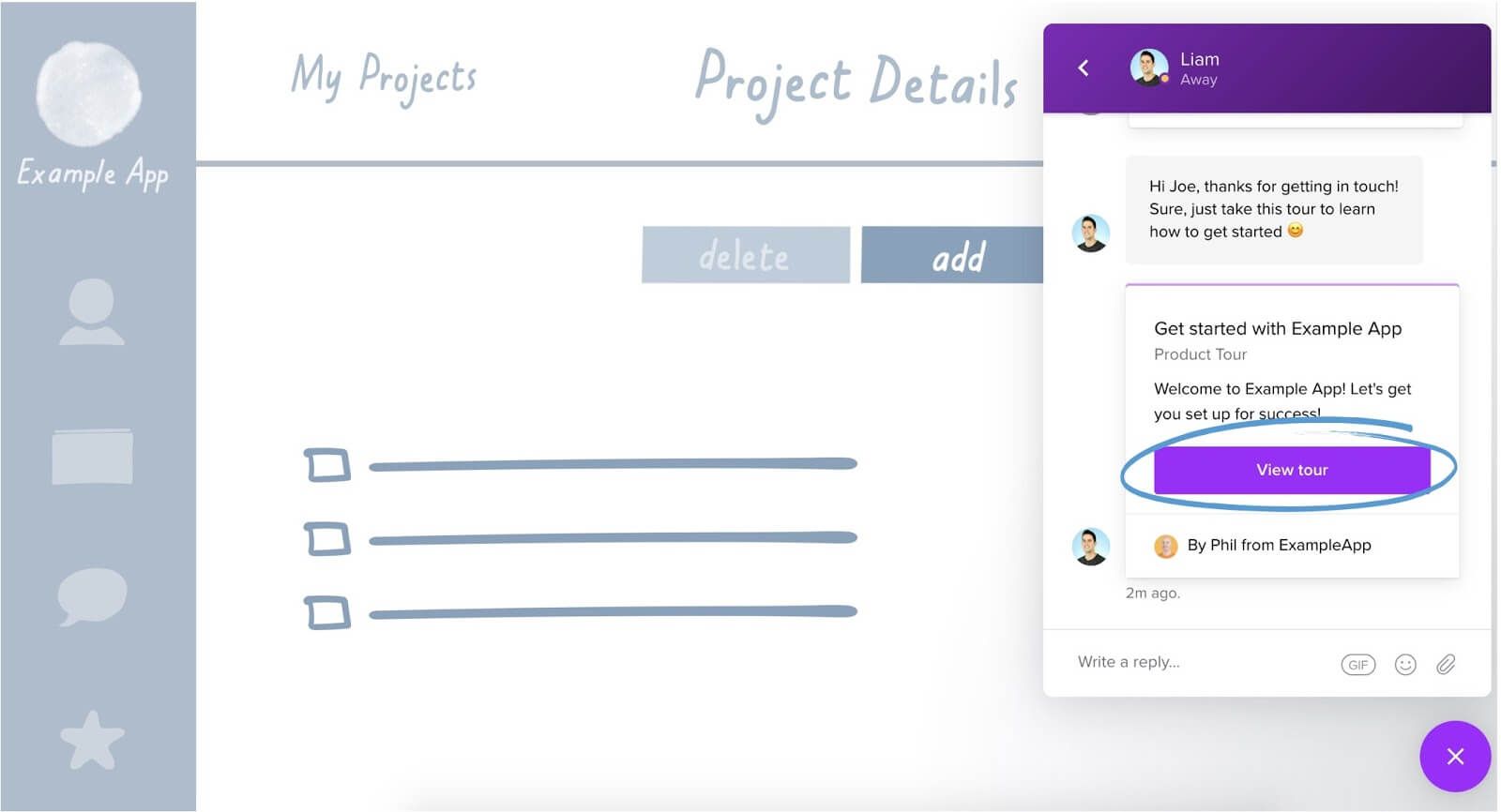
For more complex processes, enhance your tour with video content, GIFs or images to walk users through the task at hand.
Let’s return to the three core components of successful onboarding: UI design patterns; contextual educational content; and contextual communication.
Product Tours and the Intercom platform combine all three into one seamless experience. Previously, UI design patterns lacked a lot of context, educational content was siloed in the help docs, and communication was based on the movements of the average user, rather than the actual user. Now they can be interwoven to build a much more powerful onboarding experience.

